Wednesday 20 October 2010

InDesign 20.10.10

8 mistakes 

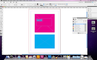
1. No bleed on the first page 
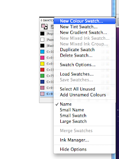
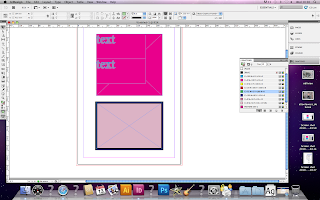
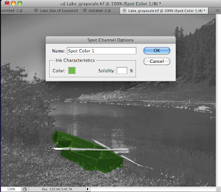
2. Two spot colours not in use
Select all unused of the swatch palette


Images need to be the right size 
Resolution has to be 300 dpi
Needs to be in CMYK 
File format needs to be correct, PDF or TIF cannot be a jpeg

3. Tree silhouette- link missing 
4. Bird 3 is in RGB not CMYK 
5. Blue swatch is also in RGB not CMYK
6. The resolution for bird 1 is 72 dpi  not 300 
7. Scale of bird 5 isn't 100% because the size has been changed in InDesign 
not in Photoshop 
8. Back cover has been filled with the registration colour so is over 
the limit
Separations preview - ink limit- anything over the limit will show up red.


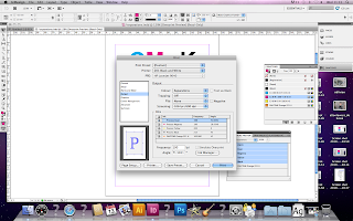
Links palette- click on the pencil to edit the original image for example if you need to change the size of the image or the resolution

To tell it what program to open with when you click on 
the pencil 
file folder - click on the image- get info- open with 
change to photoshop


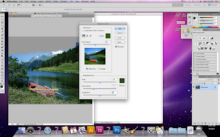
Change to percentage when editing scale in photoshop


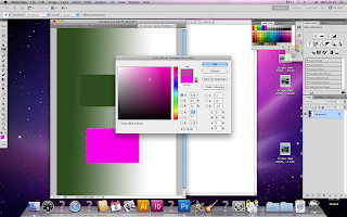
Image 3 saved in RGB- Edit it on photoshop
Mode- CMYK


Image size- cannot make the resolution higher. Need to get a new image 
As soon as you save it, it will immediately update on InDesign 

If you do not have the original illustrator file it will print very pixelated. If you do have the file it will print exactly the same as it looks on illustrator 
You need to have all the image files present

When finished on InDesign 
File- package 
Gather together everything necessary for the file to work 

Links and images - save
can add notes i.e do not print spot colour... 
'Preflight'

Legality warning will pop up 
You can give the printers a copy of your adobe font. It is now legal

Will now have a copy of all images, fonts, etc and can now be sent to print

or.. can save as a PDF 

This will embed all the images, fonts etc into one file 

File- PDF presets- Press quality 

Smallest file size- If you want to send it to your client to check over will look good on screen but not when printed 

Export
Marks and bleed 
Use documented bleed settings 

PDF will be smaller than package file 


Type workshop

fg14.10.10

Bigger type and weights read first

This doesn't work, the big type is unnecessary, makes you read them first 
It it written across and down the page which your eyes are already trained to do


Hierarchy - Wrestling poster
1. Who's wrestling
2. Who it is
3. Where it is
4. How much it is


When looking on a screen you can't tell what it will look like as a leaflet. It will look completely different so you won't be able to see which leading, point size and font etc will work best

Never decrease the default leading. It will not be legible

Paragraphs
A pause, hundreds of ways to put a pause in text

9-9.5 average size

Wednesday 13 October 2010

InDesign workshop

InDesign CS5 workshop

Open new document
Bleed No white lines etc when cutting out
Standard bleed amount 3mm

Facing pages- DPS (double page spread)
will it be bound as a book?

Always apply colour in a frame or something contained in a frame
Swatches palette similar to illustrator


You can add swatch colours created in illustrator and photoshop


Swatches palette
Can change the tint- Just change the percentage
New tint swatch
Can't change the percentage of CMYK just the percentage of the tint

As soon as you enter colour value it will change from process colour to spot colour

Click over something and hold the alt key and drag to duplicate

Windows- output- Separations preview


5 printing plates
Printed on acetate to see how it will print- like screen printing


Print options
Set up- page position- Centred
Marks and bleed- Crop marks
Registration marks(again like screen printing)
Page information- Need to know which one will print Cyan, Magenta etc
To print colour separations
Output-Colour composite CMYK change to separations
Click on the small colour box to chose which colours to print
Will print a 5 page document Cyan, Magenta, Yellow, Key and the spot colour
Can now be used for printing plates or screen printing

Swatch Palette- select all unused

Reference number and colour will be printed at the bottom of the page

Halft tone screen, image tiny dots

Window- output- Attributes- overprint fill

Trapping
Look for the lightest colour apply stroke to type same colour as background

Attributes palette- Overprint

Monday 11 October 2010

What is good? Alton Towers

Tagline- I survived air.. i want to come up with a tagline like this

I want to look at proverbs and see how i can link them with rollercoasters, maybe changing them slightly

These could be printed on a range of different prodcts that could be sold at alton towers in the gift shops for example T-shirts, mugs, sweets, key rings

Could be printed on sick bags- novelty sick bag

Eye badge that looks like hands covering your eyes
T-shirt, hoody that has the image of a safety harness from a ride on it with hand clutching it
Rain coats that looks like its soaking wet
Drink bottle that has a screaming mouth on the bottom so you see it when you drink out of the bottle
Carrier bags where the inside looks like the whole you go into on the ride oblivion

These would be mass produced so could be flexo printing or pad printing for the 3D products

It will be Package and promote.

Thursday 7 October 2010

Type workshop

Kerning

When you write the word railway it automatically looks like its split into words, rail and way, because the kerning between the 'L' and the 'W' looks bigger than between the other letters. Therefore we need to change the kerning. One rule with kerning is you never make the kerning smaller so we need to make the kerning between the others letters bigger to make it look the same.
When we do this it is more for big branding rather than big amounts of text.

For my name i found that the biggest space was between the 'D' and the 'Y', i therefore needed to make the kerning for the other letters bigger. When i did this the letters looked to spaced out, so i made the kerning smaller between the 'D' and 'Y', although your not supposed you can break the rules when necessary.


For this exercise we had to write the words One, two, three and four. We had to make the first word you read 'One' but it had to be at the bottom of the page, I made the word 'One' the biggest word on the page and in upper case letters and bold type. I wrote the rest of the words in a smaller, lighter font and in mostly lower case. When i got feedback i found that the first word you read was 'Two' rather than 'One' because the kerning on 'One' was too far apart and our eyes are lazy so automatically go straight to the next biggest word.


For this one we had to make the word 'Four' be the biggest word but still read 'One, two and three' first. I did this by putting four at the bottom of the page and giving it a lot of kerning so the eye reads it last.


This one was similar but we had to make the eye go from the center of the page, to the bottom and then to the top.


We had to do a similar task for this one except all the words had to be the same size, weight, font and kerning i therefore put 'One and two' on the left and made four read on its side so its the last word you read.


We had to type up a proverb for this exercise and put it in two lines, correctly how it would be read for example where the comer would be.


Wednesday 6 October 2010

Design for print

Software workshop- Photoshop

Resolution 300 dots per inch for commercial use

Lab colour

Bitmap- Image that only contains black or white pixels

CMYK- For commercial use

8bits per channel- Measure of information in each pixel

A lot of things you can't do on CMYK setting on photoshop default setting is RGB, same with scanner

RGB is capable of showing a wider range (Gamut) than CMYK
It's best to work in RGB, when changed to CMYK the colour will change and become a lot duller and less vibrant

When working in InDesign it automatically converts to CMYK

View- Gamut warning
A grey layer will appear on the colours that will not print in CMYK mode

Image- Adjustments- Hue and saturation
De saturate will adjust it to be more in gamut range
The grey overlay from the gamut warning will be reduced

or..
Image- Adjustments- Replace colour
Select part of the image, change fuzziness for amount of image

View- Proof colours
Cannot create out of gamut range colours
Best of both RGB/8/CMYK
What ever colour you see on screen is the colour that will be printed
Last thing you do Image- Mode- CMYK
Window- Swatches
On the colour swatches,c lick on the warning triangle to take you to the nearest printable colour
When you put the gamut warning on this colour shouldn't change

To delete swatches hold alt and click on the colour

Press 'D' on the keyboard to switch foreground and background colours back to black and white
Press 'X' to swap them around
Choose colour- Make sure its a printable colour, add to swatches

Eye dropper tool- Top half new colour, bottom half of circle old colour. This colour will become the foreground colour. Click on the background of colour swatch to add to swatches

Save swatch, drop down menu, right of the swatches panel- Save swatches (Same as in Illustrator)

When you use spot colour it is the same on the screen as when it prints. Its cheaper to use as you only use one printing plate rather than four for CMYK.

Swatch palette
Spot colour library
Click on the pantone colour, it is loaded as foreground colour. Document is RGB, change to CMYK, it will now need four printing plates so negates reason for using spot colour.

Duotone image
Image needs to be grayscale
Image- Mode- Duotone

Click on the black square to choose a spot colour to replace the black
Colour libraries to pick a spot colour
Type in pantone ref no.
Save as PSD file
When opened in InDesign the spot colour will be there using its unque ref no.

Duotone options
Type- Duotone
Ink no. 2 becomes activated can change second spot colour
Now have 100% of each colour
Can change percentage using the curves

Chanel palette
New spot channel
Channel is in black and white

Solidity- Transparency of the colour

You cannot create tints to spotcolour on Photoshop like you can on Illustrator


Tuesday 5 October 2010

Print analysis


What is good? Presentation

Alton Towers

What is bad about Alton Towers?
Long queues
Expensive, ride photos, gift shop, food and drinks, ticket itself
Getting wet on rides, in the rain

Package and promote
Distribution strategy- Maybe sold in the gift shop, cheap to buy, needs to be cheaper than buying a fast track ticket
Product- something interactive

Concept
Queueing is boring
Things are expensive
You don't want to get wet on the rides

Audience
Children, teenagers, People who go on rides

I want it to be clever, funny for example the plastic carrier bag thats looks like the handle is a mouth, promoting nail biting cream

Getting wet at alton towers, rain macs, could have funny designs on them

Ink that changes colour when the temperature changes

Research existing products rain macs, gift shop products

Print design and production methods
Print on drinks bottles, t-shirts, rain macs, sweets, back of ride photo's

What is already out there? All the above are already so would need to be adapted
I want it to be funny and humorous

Could be a pack and contain sick bags, eye badge to cover your eyes on scary rides, ear plugs to block out the screaming, super absorbent pants incase you have an accident on the rides, sickness tablets, rain mac, blow up pillow for rita as its so fast

Each one could be specific to each ride

RAF pilots had special trousers to stop blood leaving their legs when they fly at full speed into the air. Oblivion could have a joke mimic of this at its a fast speed drop roller coaster

Look at the bad things about alton towers and look at how you can make them good-funny for example being sick on a ride is bad so make a sick make or sickness tablets

Further research
Look at existing 'Joke' packs to see their style and effects

Packaging- Utilitarian function a pack containing the sick back etc which will protect and distribute the contents

Who its for, where it will be distributed, who can buy it?
Could be sold at gift shops, anyone could buy it, appealing to young people, children, teenagers, supposed to be jokey so anyone who finds funny

Research into existing modes, forms and formats of packaging

More than one production and method of delivery should be considered also stock choices, print processes and method of distribution

Where would it be sold? Do people go into the gift shops last? They could get them at the ticket collection or there could be a poster of advertisement telling you where you can buy the pack

Are they free? or cheap?
Is the alton towers logo on it?

Design Production Print

The production manual

Content
Informative, teaches you, tutorials
Categories
Design basics, elements, colour, pre press, production, finishing

Form
Glued, not A4, different types of stock, 29.9 x 29.8, columns, not the same throughout, hardback, coated and uncoated, mostly uncoated

Format
Spot colour on front and inside pages

Product and range
No range

Media and process
Relates to content, different stock, tutorials, bright colours

Mass produced, Canada, USA, made in Singapore
Print process either Litho or web

Audience
Learning and developing designers
No interaction

Form and function
To educate, inform and direct

Scale and context
Average manageable book size
Table rested specialist design book
Weight thickness of book
Designed for a designer so they can't get away with cheap nasty stock


Kick Ass DVD case
Content
Embossed DVD sleeve, DVD and case, UV coated glossy

Litho or web


Design Production Print

Form/function/production

Content and categorisation, become an expert! Opinions

Content, form and format

Product and range
One solution, range out different outcomes

Media and process
Does it relate to the content, form and format?

Audience and interaction
Consider how the audience is going to engage with it
Who is the audience?
Do they have to interact with it?
Is there a surprise?

Form and function
Does it have a dual function i.e a book thats also a bag

Scale and content

Monday 4 October 2010

What is good? 22.09.10

Ten things I think are good

1. Cooking for other people
2. Skype to family
3. Long phone calls
4. Hot bubble baths
5. Running
6. Buying new shampoo
7. Travelling
8. Finishing a project or brief
9. Birthdays, mine and others
10. Christmas

In this workshop we were told to write down ten things we thought were 'good'. We then got into groups of 5 and shared our ten things with each other. Then as a group we had to chose ten of these that we all agreed were 'good'.
After swapping our list with another group we had then say why these things could be bad for example Long phone calls is good, but an expensive phone bill isn't.
This helped us to further our research as we can now look into our summer brief research and expand on the subject we've chosen as to why curtain aspects aren't actually good but can be made good.

Type Workshop 30.09.10

Beginning of typography - February 1452 - Gutenberg bible.
Information Revolution - information was available to everyone. Being able to communicate.
Next Revolution - Internet.

Experiment with different size paper for example by folding it.
A word is a visual form of speech. Select type to visually communicate speech in a certain way.

Times new roman created in 1937
How are upper and lower case used to make decisions to communicate?
8.5pt for a novel 12pt for a magazine because of the way you hold it. Same with columns and margins because you wouldn't want to have to move your head to much when your reading.

Task one
To use different typefaces with different weights i.e bold, light etc, different sizes and different composition to express a lonely, friendly, shy and a guard dog.


Friendly dog


Guard dog

Shy dog


Lonely dog


CS5 Illustrator Workshop

Colour swatches

Clear swatch palette, click colour(s) and drag to the bin to delete.

Choose colour, create swatch. Double click on it and click on 'Global', add tint colour guide, create new swatch.

Process colours CMYK
Spot colours- A colour that is not a mix of CMYK.

Own printing plate- Ready mixed ink.

Colours you can't create with CMYK i.e metallic colours, fluorescent colours.

Branding colours always needs to be the same.

Cost
Spot colours can be cheaper than CMYK as four printing plates have to be used. The more plates the more expensive. Spot colour only requires one plate.

Spot colours on illustrator- Open swatch library- Colour books.
Pantone solid uncoated- Small list view, gives you names of spot colourand unique reference number.

Show find field- Type in reference number. Double click to addto swatch palette.

Pantone process uncoated will be printed as CMYK.

For a varnish use spot colour but specify to printer not to print that pantone colour.

Save swatch library AI to access from any Illustratorfile.

Save a s ASE (Adobe suite exchange) tints will not be open and will need to be recreated in other programs.

In other programs such asInDesign click on swatches- Load swatches- Find swatches, Open.